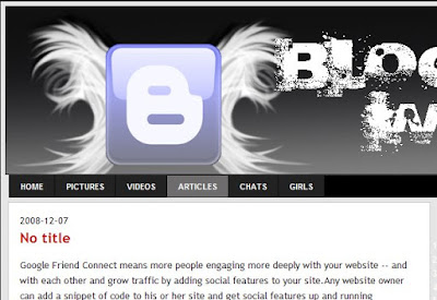
Horizontal Navigation Menu Links For Blogger:-This is very important hack for bloggers as we need to create a top menu of links with our important blog links to important pages making the navigation in your blog very easy for your readers.As i have also explained an easy way before to add top menu links to blogger but some would have not liked the styled of that navigational menu links.So i will be giving a tutorial to add beautiful top menu links of which you can change colors also easily from css.The
installation is simple not much difficult.I hope you will do it easily.
You can see the the menu ,how they will look after adding from below image.How to add these top navigational links below blogger header:-

Just Go To Layout > Edit Html
And Search For </b:skin>
Now add these below Css codes before it-
Please edit the width of the above codes in red to adjust to the width of the navigation menu to adjust it to yours template width.You can change the color and design of above css also if you are capable of it.
Now Search for below codes-
<div id='header-wrapper'>
<b:section class='header' id='header' maxwidgets='1' showaddelement='no'>
<b:widget id='Header1' locked='true' title='Testing templates (Header)' type='Header'/>
</b:section></div>
And add the below codes after the above codes:-
Thats It Now Preview It.If its working fine just save your template.
Change the # above with links to yours.I hope you would like this navigation menu for sure.I will be back with one more great navigation link bar menu for sure ,uptil then enjoy this.
This Post is written by: Ritesh R. Warke GPRS Expert & Webmaster. Ritesh R. Warke is a professional Ethical hacker, web designer and front end web developer.
installation is simple not much difficult.I hope you will do it easily.
You can see the the menu ,how they will look after adding from below image.How to add these top navigational links below blogger header:-

Just Go To Layout > Edit Html
And Search For </b:skin>
Now add these below Css codes before it-
Please edit the width of the above codes in red to adjust to the width of the navigation menu to adjust it to yours template width.You can change the color and design of above css also if you are capable of it.
Now Search for below codes-
<div id='header-wrapper'>
<b:section class='header' id='header' maxwidgets='1' showaddelement='no'>
<b:widget id='Header1' locked='true' title='Testing templates (Header)' type='Header'/>
</b:section></div>
And add the below codes after the above codes:-
Thats It Now Preview It.If its working fine just save your template.
Change the # above with links to yours.I hope you would like this navigation menu for sure.I will be back with one more great navigation link bar menu for sure ,uptil then enjoy this.
This Post is written by: Ritesh R. Warke GPRS Expert & Webmaster. Ritesh R. Warke is a professional Ethical hacker, web designer and front end web developer.
- Follow him on TWITTER.
- Stay Connected with us on FACEBOOK
- Subscribe to our FEEDS HERE


0 comments:
Post a Comment